I do all sorts of graphics work and I am slowly but surely transferring my work onto this page. It will take some time before I get all of it on here.

Shortcuts to various categories

Monday, December 19, 2011

Advertising

These selections are the winning drafts for work I have done for various groups and companies around the world.

This was an ad I made for a friend for her company. She messaged me on QQ asking if I would care to submit a design for an ad in an english speaking magazine. This is what I came up with from the components they gave me. The company was a manufacturing group that fabricated machines used to create metal tubing. I used one of the pictures they sent me and extended the  metal band into the foreground because I felt it needed a little 3D effect. I also cleaned up the machine of rust in photoshop as well as tweeked the tones to be more visually appealing.


This next one is a design I made when it popped into my head. As you can see it is an iMac sitting in a forest. The desktop background as you can see is the forest. I thought it would be something fun to make. Maybe one day I will send it in but for now it just sits in my portfolio as another example of my work in photoshop.

Thoughts?

More coming soon!

Friday, December 9, 2011

School Projects winter trimester 2011

Album Project 

Here I have the project drafts for one of my recent assignments: Redesign a music cover. I chose singles, quite simply because its easier to represent one song than a whole album. What can I say I'm lazy.

On a similar note, I can't upload the nice full resolution PDFs to blogspot (or tumblr apparently...) so I just screenshotted these off of my desktop. As a result, they are somewhat lower quality than the original files and may have tiny little white borders on them from cropping out the rest of the screen.


Here I have a picture of my brother I took for a separate project, but used it here again for the song "empty spaces" by Pink Floyd. I used what to me seemed like a fitting picture, he glances down guiding the viewer to the title. The back contains the lyrics to the song, creatively bolded, and slimmed in an attempt to guide the reader to understand the mood of the song. I used another picture from the same photo-shoot because I felt like there was too  much space unused. Again I used a picture that I felt fit the mood. Also, you may notice the lines from the picture match roughly with the text next to it. The video has different audio so heres the album audio
This one is a song from the Three Days Grace album "One X." The song is called "never too late." It holds great meaning to me. My interpretation of the song is neglectful parents ignoring their children's struggles. This feeling is exemplified in the line "I will not leave alone, everything that I own, to make you feel like its not too late, its never too late." I had a very violent and unpleasant early childhood. My school was a very hostile place but no one, including my parents were willing to help. This is the reason for the yearbook photo. I added injuries to my face from one scratch that was already there. Like a large amount of the photographs I work with, I like to drain the colors. I feel the color sets the mood, and in this case it creates this bleak effect. On the back, there are again, the lyrics bolded and slimmed based on the flow of the song. Again, the right side is left unpopulated by the text, so I added a hand, again drained partially of color. This was done partially for consistency and to make the cuts on the inner arm show up more effectively. I used a scratch again to create these letters. I felt that it would be worth while to incorporate the title on the backside as well. So I used a self harm theme here to again show the dark places someone can find themselves when someone they need is not there. While I never engaged in such activities, some of my close friends did and again, I felt it fit the theme. The video (warning this song is known to make people cry)


This one is highly experimental. I figured I would divert from my usual tendencies for gritty color drained photos. I incorporated a vectorized version of a hand drawn sketch from a hallucination I had once. Incase you cant tell, they are eyes being turned inside out. It looks a lot better in the original sketch but oh well. I incorporated a similar style to the title he uses for his actual album covers. I have included the title of the song aligned with the artists name. The title is "Nine Spiral" and I slimmed and bolded them to put emphasis on the real focus of the song (as far as I can tell!) Behind the eyes there are semi random curves with different shades and gradients of red. The idea here was to contribute to that sense of "spiraling." The back is a little more in my comfort zone. I dropped the background into a new document  but it was imported oversized. I realized that I rather liked this so I left it. I included the lyrics in Japanese, English, and what the lyrics website called...Romanji? It seemed strangely empty to me, so I included an image I created of him based off a photo I found online. I put it behind the text and left the face out. I feel that it really creates an interesting effect. 
No video exists, heres some concert footage.

What can I say, I am a passive Green Day fan. A lot of my pre existing photography has a bleak, abandoned, lonely mood to it so I figured that "Boulevard of Broken Dreams" would be a cool choice. This piece again represents a bit of experimentation in my style. Perhaps it is a little corny, but I used a green overlay since it is a GREENday song. I don't know, I sort of like the look of this, the back more so than the front. I have the lyrics as usual on the back but stroked with a 25pt outline for visibility. I think it may be a little too thick though. It looked ok in Photoshop but a little too thick in Illustrator. Video

This next one is another experimental concept. It is for a thrash metal band I used to listen to a lot. I decided to make a record sleeve for their "Think This" album. It has in my interpretation an overall theme of TV mind control and humans destroying themselves. I ran with this mind control theme with the front cover inspired by the original cover featuring two parents with whited out eyes, and a child facing a wall of TVs. The back is directly inspired by the child on the original front cover. This photo originally was a photo I shot because the scene reminded me of a shot from the "Pink Floyd The Wall" movie. I readapted it to fit this newer interpretation. The child is sitting on some garbage and watching a filthy TV out in the middle of a field. The TV was edited to glow and cast a beam of light over him to indicate he is captivated by the broadcast. I rather like how this one came out but I have not made my mind up on the front cover yet. I have many different crops of the same photo of me for the front. My current favorite is the one displayed here though.

Your thoughts are welcome and comments highly encouraged.

Thanks for looking!

Tuesday, August 9, 2011

Stencils

All of my life I have loved to do stenciling. In my first years of High School I started to make stencils from pictures as well as some free hand by my own design. This has proven to be a lot of fun!

Lyme Disease has played a huge role in my life, in fact, it nearly ended it. When I was little I felt like an outcast because I couldn't do anything. I was treated as if I was contagious and to be avoided. I made this as a stencil to describe how I felt back then. 
This is a stencilized version of a picture of one of my favorite singers. His name is Gackt, he is a Japanese singer/actor. I have found I always have trouble with eyes.
Something about Richard Nixon is just very interesting when it comes to stenciling. A certain amount of distinctiveness as well as a somewhat sinister look.
The idea that his name could be spelled this way and phonetically work as well as being a palindrome seemed really cool to me. The backwards N was sort of a Cold War Communist joke. 
This picture of the Ayatollah to me seems really cool. I very much like his look, one of the most distinctive faces of the 20th Century in my opinion.

A simple stencil of me with a minimalist somewhat cartoonish approach to the face. I do enjoy this one
A picture of me from below. The only real recognizable features of mine in my opinion are the shirt and hat. 
This stencil of me is my latest official "me" stencil. While it does not bare a huge resemblance to me, something about it I just like. 
This is a stencilized version of a very famous picture of a german soldier during WWII. This is one of my favorite photos of the war and though I had to attempt it. I am pleased with the results but again I cannot seem to do eyes that look right to me. 
While I am not a huge fan of 300, some of the characters I felt were very stencil worthy.
Xerxes to me was just very visually interesting. So much detail on once person. 
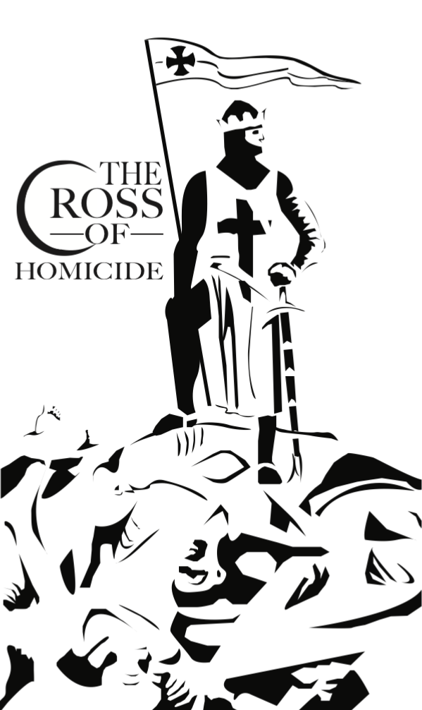
This stencil is a little more graphic than most. It is a piece to protest the Crusades, killing of another people hiding behind the will of God. "Thou Shalt Not Kill!"
This one here struck me, I watch a show where one of the characters looks shockingly similar to this man. So I promptly applied my process to make a stencil from it. 


Russel Brand, the actor who plays Aldous Snow in the popular movie Get him to The Greek


Rasputin 


Alec Baldwin 


Three Vietcong Guerillas 


Max Hansen (Some SS guy)


Mother Theresa


Mahmoud Ahmadinejad 


This is my response to the Occupy movement. Specifically toward those who went home every night after a day at the park. While I empathize with many issues they must deal with, few of the members really showed the determination it takes to make real change in the world.


Every few months I do a new stencil of myself as I am growing my hair out so it needs more frequent updating.


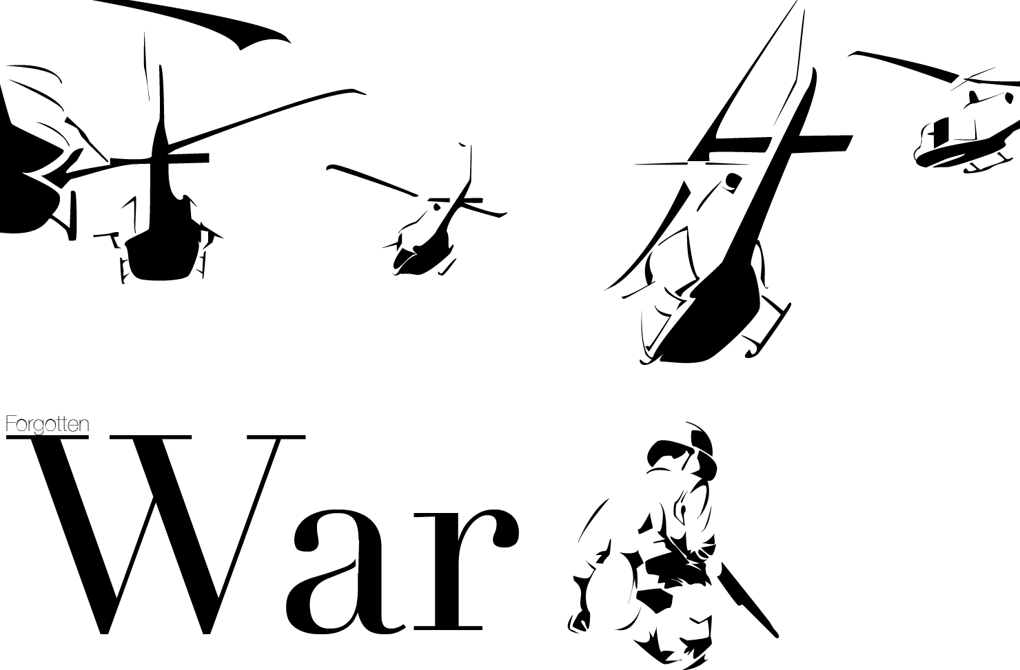
This is a stencil dedicated to my dear friend Will. He served six tours in Vietnam with the special forces. On his sixth tour he lost his leg trying to defuse a bomb attached to a child. He returned to his country a hated outcast and has been largely ignored by his country ever since. I tried to go for that feeling with this stencil.


An African child soldier smoking a cigarette holding an RPG rocket


A Vietnamese woman holding a cloth to her face, surely looking at some unspeakable horror 

The first successful stencil of my brother 


Like what you see? 
Want a stencil made? 
Send me a text @401-932-8694 No calls please! 
Or comment below.